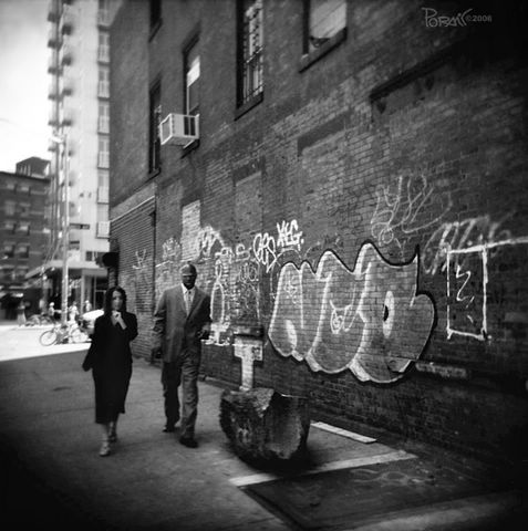
"Gansevoort Market" in Meatpacking District, NYC (negative film, 2006)
click here for colors version.
295 graffiti
Jun 4, 2006
Subscribe to:
Post Comments (Atom)

"Gansevoort Market" in Meatpacking District, NYC (negative film, 2006)
click here for colors version.
13 comments:
I like the b&w better. The color of the building is good, but there something about the background of the color version that distracting. The b&w lets you focus on the pair walking and the graffiti.
Brilliant. This image has the force of a nostalgic movie a pulp fiction but it goes mas there.
The lady seems to see an obstacle in your way and separates. The man knows that your parents were prominent figures of a book. The dark spot and the strange sculpture have been always there.
If the walls were speaking they knew that "OUTDOOR-EXPOSURE" would pass for also there. I like this photo.^.
interesting
I like the framing very much. I'm getting used to the girl being a tad blurry. I like the vignetting. It adds a lot of character to the shot. Kind regards, Brent
this is awsome shot! take care
Great shot as usual..Really like it..
Cheers
I like the contrast between their business appearance and the graffiti on the wall.
I love the effect you get with this film.
Loving the vignetting,
Loving the scene,
loving it all.
GREAT GREAT SHOT!!
School is starting so I will not be able to come and comment as often as I would like to, sorry :(
I prefer too the B&W, it increase the different kind of opposition, as the others comments have said.
I prefer the b.w shot over the colour. Maybe the colour version is too saturated and the colours all seem to bleed. the b.w is just so amazing....it just works. love the people, their sharp clothing in contrast to their surroundings.
The B&W shot as usual is much better. Quite too many distractions in the colour one.
Lovely shot Poramit.
Film has something special...I like the dark blurred frame. Nice shot.
Post a Comment